In short: I don’t use any fancy gimmicks.
No lipstick on soft red fruit to enhance colour impact. No soap bubbles to simulate foams. No cheese slices simmered in water on a cold blow-torched chicken breast with fake grill marks. No oil or water spray just before photographing to add glisten and shine.
I don’t plate with tweezers either. Though I do admit to owning a few squeezy bottles.
My dishes are simply the creations of a passionate home cook. What you see is what you get. My pictures are taken on my smartphone seconds before serving. Far removed from the uber-stylish professional dishes in glossy magazines.
I am a firm believer that you eat with your eyes first though. So I do try to make each dish look the best I can. Over the years, I’ve picked up some simple tricks to help with plating up and photography, that I’d like to share with you.

Lighting
The right lighting can be a challenge: I like mood lighting when entertaining, and even when cooking up a storm in the kitchen, I don’t like the lights on at full tilt. Makes for more relaxed cooking. With a glass of vino.
Professional food stylists remind us though, that even the slightest hint of daylight does wonders for your food photography. Well, I have a busy day job, so I do most of my cooking in the evenings. And even at weekends, food will be photographed when it’s ready to eat, daylight or not.
So I confess I often momentarily rudely blind my dinner guests with a sudden sea of light, quickly take a load of pictures, turn the lights back down, smile and continue our cosy dinner as if nothing happened. Thankfully most of them like to get involved themselves, which has been known to end up in a full-blown team-styling session with loads of giggles.
For example, on the night of my Belgian menu, one of my guests spent at least 10 minutes meticulously placing chocolate curls onto the Chantilly cream topping of his chocolate mousse, one at the time. He then accidentally managed to leave a huge fingerprint on the glossy surface. “It’ll be OK if you take the picture from the other side”, he said. Herewith:

In an attempt to get rid of unwanted shadows, his wife decided to switch off all the dining room lights and shine the torch on her phone onto the mousses instead. We all agreed that cold white LED light does nothing for food photography. Though we all kinda liked the “three in a row”.

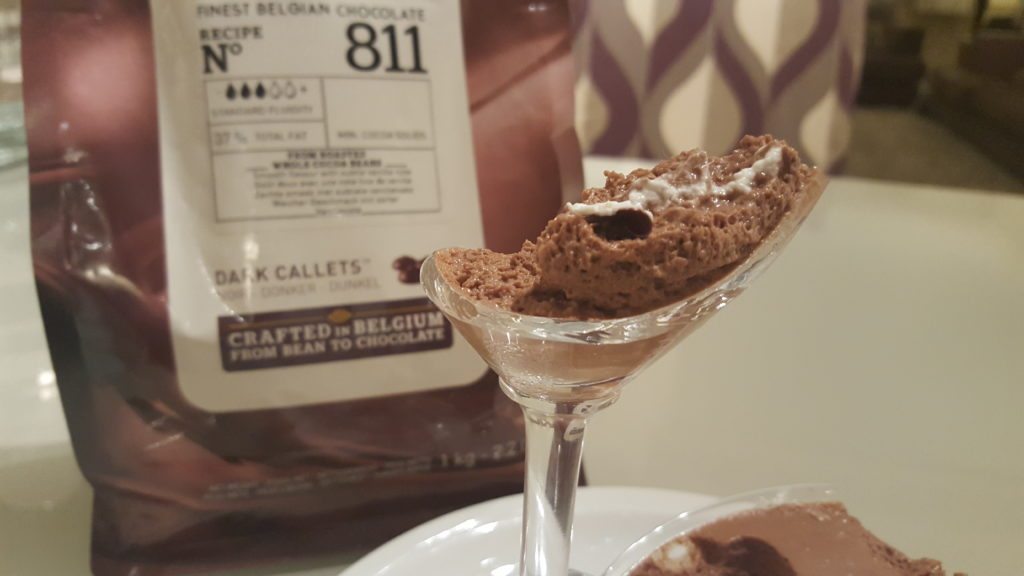
The best picture that evening came about by sheer accident. Literally, as I clumsily knocked over my choccy mousse! Sitting pretty on it’s high stem with an elegant slither of cream, the little that remained actually showed off the light and airy texture of the mousse. Note how my friends quickly did some clever product placement to hide the ugly chest freezer in the corner. I am amazed I even managed to take this picture, as I was shaking with laughter.

Anyway. I digress.
The difference in lighting is perfectly illustrated by these fish coujons, first served on a black plate in the evening:

Then the same the next day on a white plate by daylight. Looks like two different dishes, right?

Plating Up
In general, any puree will go onto the plate first. If you want a mirror of sauce, the sauce goes next . Else the vegetables and starch, if using (rice, potatoes, quinoa, …). Then the centerpiece (meat, fish, …). Lastly any sauce, dressing or salsa, as well as any other small garnishes that help the flavour and look of the dish “pop” (herbs, seeds, little things of loveliness).

Make sure the centerpiece nor the rest of the plate are completely covered or drowning in sauce though, as the sauce is usually not the star of the show. A generous drizzle over and/or around should suffice.
Hunks of boneless meat look better sliced, either at an angle (traditional) or in straight fat slices cut lengthwise (very on trend at the moment).
Don’t overload the plate. A 2/3 ratio of food to plate apparently makes the food look more appetizing. This is a guideline I struggle with. I’m a feeder. I don’t starve my guests. Either I need to get bigger plates, or remember more often that I can serve the rest in warmed bowls on the table for guests to help themselves.
Stir fries, curries and rice dishes are notoriously difficult to plate up beautifully. But instead of that mountain of rice with a heap of curry plonked on top, try rice or noodles in a separate bowl or upturn a small bowl jam-packed with rice off-center onto the plate. Drain the curry or stir fry from excess sauce and place in a half moon around the bowl. Drizzle just enough of the sauce over or around. If using an upturned bowl, only remove the bowl once the rest is plated.
Garnish with fresh herbs, sesame seeds, a twist of lime or some slivers of fresh chili. Serve the rest of everything family-style in warm bowls at the table.

Pasta and noodle dishes are an equal challenge. Tasty, but not always top of the aesthetics league.
Mix your pasta into the sauce first. If using spaghetti, linguine, tagliatelle or noodles etc., twist the strands around a meat fork and carefully slide the them off onto an over-sized deep plate in a semi cone shape. If needed, repeat on top of your first go, to establish a bit of shape and height. Spoon over some of the veg, meat or fish left in the pan with a slotted spoon.
Finally spoon extra sauce around your pasta mound and garnish with fresh herbs, a drizzle of olive oil, some toasted pine nuts or a good grating of fresh Parmesan (or Parmesan slivers, just never the ready grated dust) and a grind of black pepper.

Works great for other pasta shapes too, minus the twisting step.
I serve risotto in a deep round plate, dotting some watercress over or around for crunch and color. If it’s a good unctuous risotto, you should not be able to shape it or pile it up high;-)

Which brings me to…
Colour
Will everything look beige or brown?
Let’s look at the evidence. Both the sweet potato crush with sausages and onion gravy and the pear and almond tartlet with chocolate sorbet and chocolate sauce taste wonderful and the posts have a lot of info and advice. Yet these are the least visited posts on my blog. Coincidence it may well be, but I strongly suspect that the lack of colour “pop” in the pictures (and the melting sorbet) is a major contributor to that.


So add a touch of contrast colour whenever you can. Cubes of red pepper, some brightly coloured carrot battons, a scattering of spinach, rocket leaves or fresh herbs or a few oven roasted cherry tomatoes. For desserts, fruit, a coulis or a mint leaf work well. Not only will it elevate your dish, it will look so much more tantalizing on the plate.
For pictures specifically, if you can’t add anything sensible to the dish, as it would be completely out of place, drape a brightly coloured tea towel under your culinary creation. This provides instant appeal and a comforting homely look. This brown apple butter for instance is now one of my most visited posts to date, likely helped by the splash of red in the feature picture of that post. And the spoon stuck in, teasing you to have a try.

The most visited post however, is also my most colourful one: the unforgettable Ricotta Gnudi in a tomato broth. I rest my case.

Choose the Right Plate
Round, square, rectangular, black, white, glass, deep, flat, small or large. Choose whatever will off-set the colours of your dish and suits the shapes and textures.
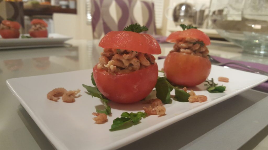
I often use multiple plates of different shape and coour on top of each other. Have a look at the different effect of using different plate combinations on these sefood canapés.
Square glass plate on square black plate:

Rectangular off-white plate on square black plate:

Now see the exact same canapé contents presented as a salad rather than canapés :

Here’s another example: meringue, prunes and cream presented on a glass:

And the same presented on a plate with a drizzle of chocolate sauce:

Is your sauce quite runny? Serve it in a slightly deeper plate. Are your dessert portions generous? Serve them on dinner plates rather than dessert plates or in tiny bowls. Not only does it look better, everyone knows you need to leave room for custard, cream or ice cream.
Once you have chosen the right plate, work with the shape and size of that plate. Plating up slightly off-center, or, ultra-posh, only on the very edge of the plate, is very in vogue right now.
Have a look at this: the same dessert, first served layered in a glass by evening lighting:

Then leftovers including a few broken tuiles on a large glass plate the next day in daylight on exactly the same table:

Creating some height has great impact too. Even a traditional English meat and two veg on a standard round plate will have more visual impact if you plate it up slightly off-center and build some height by arranging your centerpiece on top of or leaning up against the potatoes or vegetables.
Sandwiches and sweet treats look good stacked too.


Consider plating on the diagonal too. Works especially nicely on a square plate.
Serving Family-Style
Generously serving on a large platter, wooden board or slate in the middle of the table has great visual impact (Jamie Oliver is a fan). Works particularly well for tapas or antipasti.
But how about a whole roast chicken, a garlic and rosemary spiked leg of lamb or a sumptuous game pie set on a large board with colorful veggies and golden roasted tatties arranged next to it and a lovely old fashioned sauce boat?
Or an exquisite Beef Wellington presented on a huge platter with copious buttery herby baby potatoes and colourful roast veggies. I was lucky enough to be treated to this the other day by a good friend. Definitely had the wow factor.


Have you got a grand old soup tureen or an old fashioned cake stand or a fancy lazy-suzan hiding at the back of the cupboard? Use it! Cheese looks great on a cake stand. Retro is trendy!


Consider the Angle
Many top chefs have their dishes photographed from the top, to show off the composition of the plate.


Mine usually don’t work out brilliantly like that, probably because my “composition” tends to be far from composed. So I get right down low and up close and personal instead. Don’t confuse this with zooming in, which affects the picture quality. I literally mean get right down and dirty with that camera and your dish.
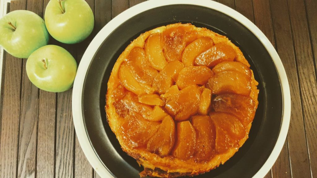
Have a look at this tarte tatin: photographed from above, with a splash of green for colour impact:

And now the same tarte tatin as a close-up :

Background and composition
Don’t forget the background of your picture, the surface under the plate, the surrounding colors. How do you want to compose your plate as well as your picture as a whole?
You’ll often see cutlery on the plate, some ingredients or a glass in the background. I play with that a little, but never long enough for the food to get cold.


The most important thing though is to appreciate the beauty of food, even in its simplicity. And even an empty plate like the feature picture of this post, the result after eating a squid ink risotto with a saffron sauce from a virginal white plate, languishing in the midday sun pouring in through the kitchen blinds. Nearly monochrome, but not quite. This is the before-picture by the way. T

Which brings me back to colour, colour, colour. Colour always makes your plate and your pictures look gorgeously appetising. 


Feel free to share your own plating and styling tips or pics!


